Snapchat was initially launched in 2011 with the name “Picaboo.” It was created to make communication through photo sharing more convenient.
The first logo was designed by the CEO and co-founder, Evan Spiegel, in just one evening, matching a smiling ghost with a protruding tongue, and since then, Snapchat has since gone ahead to improve the logo twice.
This article will guide you on drawing the current Snapchat logo from scratch, even if you do not have a flair for drawing at all.
- What You Need To Get Started With the Drawing
- What Does the Snapchat Logo Look Like?
- Follow These Steps To Draw the Snapchat Logo From Scratch
- Step #1: Draw the Letter ‘U’ Upside Down
- Step #2: Draw Two Tiny Little Hands
- Step #3: Draw the Body of the Ghost
- Step #4: Draw the Base of the Ghost
- Step #5: Make the Ghost More Visible With Thick Lines
- Step #6: Draw the frame of the Ghost
- Step #7: Finish up the Frame with Nice Curves
- Step #8: Color the frame of the Ghost
- Summary
- Frequently Asked Questions
What You Need To Get Started With the Drawing
The quality of your materials will determine how nice the drawing will be when you’re done.
Here is a shortlist of what you need to get started on the drawing:
- Quality drawing pencils of different shades.
- A sketchbook.
- A good drawing surface.
- Variety of erasers.
- A good pencil sharpener.
- Quality colored pencils (particularly a yellow color).
Have a good set of these instruments, and you’re ready!
What Does the Snapchat Logo Look Like?
The current Snapchat logo looks like a faceless ghost with a round head, two short arms, and an uneven base. With a very thick black outline and a yellow frame.

Follow These Steps To Draw the Snapchat Logo From Scratch
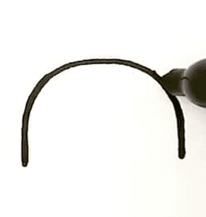
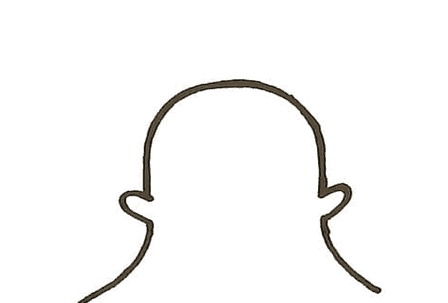
Step #1: Draw the Letter ‘U’ Upside Down
- Draw two short vertical lines parallel to each other and leave a space in between.
- Connect the top of the two lines with a nice curve.
The result would be in the shape of the head, as shown below.
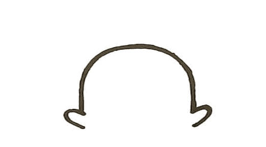
Step #2: Draw Two Tiny Little Hands
- Right at the tip of the first vertical line, draw a tiny curve just like the letter ‘c’ (but a bit wider).
- Draw the same curve at the second vertical line, but the curve would be reversed this time.
The two tiny little curves represent the hands, as shown below.
Step #3: Draw the Body of the Ghost
- At the edge of the left hand, draw a curved line and drift it to the left.
- At the edge of the right hand, draw a curved line and drift it to the right.
Step #4: Draw the Base of the Ghost
- From the tip of the left side of the body, draw two small curves and stop when it appears under the left hand you previously drew.
- Similarly, from the tip of the right side of the body, draw two small curves and stop when it appears under the right hand you previously drew. Make sure there’s a space between each of the two curves.
- Now, connect the two small curves with a wider curve (like an arc). Draw the curve downwards from left to right.
The result of these first four steps would appear to be in the form of a ghost.
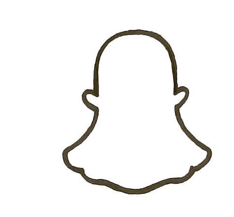
Step #5: Make the Ghost More Visible With Thick Lines
- Place your pen on any convenient point on the ghost and trace the line to make it thicker and bolder.
- The thickness is the significant difference the current logo has from the previous logo.

Step #6: Draw the frame of the Ghost
- Make a straight line to the left of the ghost.
- Make another straight line to the right of the ghost
- Make another straight line to the top of the ghost.
- Make one last straight line at the bottom of the ghost.
- Ensure these 4 lines don’t meet at any point.

Step #7: Finish up the Frame with Nice Curves
- Join each of the four straight lines above with little curves to give it a good-looking edge.
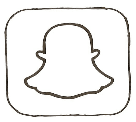
Step #8: Color the frame of the Ghost
- Finally, with your yellow colored pencil, apply the color between the ghost and the frame to add a bright feel to the logo.

That’s it! You have successfully drawn the Snapchat logo with these eight easy steps.
Summary
This article outlines the steps you need to draw the Snapchat logo with no prior experience needed. The guide describes what the logo looks like, the materials you need for the drawing, and the steps to follow.
We hope you get the desired outcome as you read and practice these steps.
Frequently Asked Questions
The Snapchat logo represents a ghost with two hands and a base.
Evan Speigel, the co-founder, chose the ghost image to represent the fleeting nature of images on the app. Once an image has been seen on Snapchat, it vanishes forever into thin air, just like a ghost.
The color yellow was used to make the Snapchat app stand out among other apps because of its colorful nature. The black outline was made thicker and bolder to make the logo more visible.
Snapchat has just a single logo. A ghostlike shape with a white body, black outline, and yellow background color as the frame. The Snapchat logo has been changed twice, making the current one the third installment.
The Snapchat logo was created by Evan Speigel in just one night when he was 25 years old.