CSS3 provides additional flexibility for working with background properties. These properties allow for much greater control of the target element’s background.
In this overview, we will be covering the background-origin and background-clip properties.
At first, it may seem that these two properties provide the same results, but we will take a deeper look and show how these two properties complement each other.
The background-origin Property
The background-origin property is used to determine how the background-position of background is determined. The background-origin property takes three different values, border-box, padding-box and content-box.
You need to understand the CSS Box Model to understand how the background-origin property is used. The background-origin property is supported in Internet Explorer 9+, Firefox 4+, Opera, Chrome, and Safari 5+.
background-origin Syntax
The background-origin property specifies what the background-position property should be relative to. The default value is padding-box.
background-origin: padding-box|border-box|content-box;| Value | Description |
|---|---|
border-box | The background image is positioned relative to the border box. |
padding-box | The background image is positioned relative to the padding box. |
content-box | The background image is positioned relative to the content box. |
Example
In the following three examples, you will notice that the background image used is positioned relative to the background-origin value. A value of border-box places the background image up to the border of the element.
A value of padding-box, places the image up to just outside of the border edge, and the content-box places the image outside of the padding edge.
<!DOCTYPE html>
<html>
<head>
    <style>
        #myDiv {
            width: ##px /* Specify the width of your element */;
            height: ##px /* Specify the height of your element */;
            background-image: url(background.png);
            background-repeat: no-repeat;
            background-color: #ffffff;
            background-origin: /* As defined by specific examples below */;
        }
    </style>
</head>
<body>
    <div id="myDiv"></div>
</body>
</html>
background-origin: border-box
In this example, you will notice that the background is positioned up to the edge of the element, placed under the border.

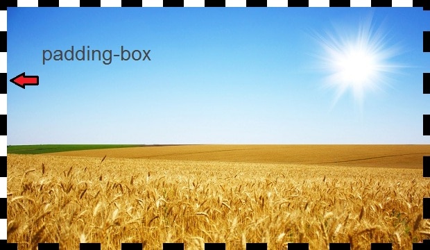
background-origin: padding-box
In this example, you will notice that the background is positioned up to the top, left edge of the border, but does is not positioned under the border. It is positioned under the padding area.
background-origin: content-box
In this example, you will notice that the background is positioned up to the top, left edge of the padding box, but does is not positioned under the padding area. It is positioned under the content area.

The background-clip Property
In order to understand clipping, you need to understand the term “painting area.” Browsers paint the backgrounds onto the elements. The painting area is the box where that background will be painted.
All backgrounds will be clipped to the box defined in that property. If the background image overflows the box, the image is clipped at the box edges.
The background-clip property is supported by Internet Explorer 9+, Firefox 4+, Opera, and Chrome. As of this writing, Safari supports the -webkit-background-clip property.
Using background-clip with background-origin
When you apply the background-clip property, you are instructing the browser to paint the background inside that box, and if it overflows the box, to clip it at the box edges.
Just as with the background-origin property, the background-clip property has three supported values: border-box, padding-box, and content-box.
You use the background-origin property to position the background image, but you use the background-clip property to set the painting area.
background-clip Syntax
The background-clip property specifies the painting area of the background. The default value is border-box.
background-clip: border-box|padding-box|content-box;| Value | Description |
|---|---|
border-box | The background is clipped to the border box. |
padding-box | The background is clipped to the padding box. |
content-box | The background is clipped to the content box. |
Example
The following examples will show how to use the background-origin and background-clip to position and clip the background color or image for the target element.
<!DOCTYPE html>
<html>
<head>
    <style>
        #myDiv {
            width: ##px /* Specify the width of your element */;
            height: ##px /* Specify the height of your element */;
            background-image: url(background.png);
            background-repeat: no-repeat;
            background-color: #ffffff;
            background-clip: /* As defined by specific examples below */;
            background-origin: /* As defined by specific examples below */;
        }
    </style>
</head>
<body>
    <div id="myDiv"></div>
</body>
</html>
background-origin: border-box | background-clip: content-box
In this example, the background image is positioned within the border-box, but the image is clipped at the content-box. Take note of the portions of the image that have been clipped. You should also note that the background color has been clipped as well.

The background-clip and background-origin properties are best used together so that you do not see unexpected results.
Keep in mind that these two properties have different default values. The background-clip property defaults to border-box while the background-origin property defaults to the padding-box.