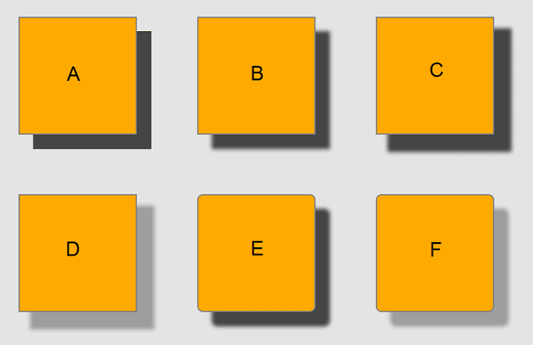
The CSS3 box-shadow property allows web designers to implement drop shadows on box elements. Developers can specify box-shadows values for color, size, blur, and offset. If a border-radius is specified on the element with a box shadow, the box shadow takes on the same rounded corners.
Browser Support
The box-shadow property is supported in Internet Explorer 9+, Firefox, Chrome, Opera, and Safari. Earlier versions of Internet Explorer do not support the box-shadow property.
Box-Shadow Syntax
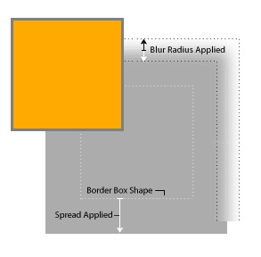
The box-shadow property can accept a comma-separated list of up to six values, two of which are required. The order of values are as follows: horizontal offset, vertical offset, blur distance, spread distance, color value, and inset , that keyword that can be used to create an inner shadow.
box-shadow: h-shadow v-shadow blur spread color inset;H-shadow and v-shadow values are required. Omitted lengths default to 0.
| Property | Description |
|---|---|
h-shadow | Required value for the horizontal shadow. Negative values are allowed. |
v-shadow | Required value for the vertical shadow. Negative values are allowed. |
blur | Optional value for blur distance. The larger this value, the bigger the blur. |
spread | Optional value for the size of shadow. Positive values will cause the shadow to expand, negative values will cause the shadow to shrink. |
color | Optional value for the color of the shadow. |
inset | Optional value, default is outset. Optional value is inset. |
Examples
Here are some examples that should work across the browsers that support the border-radius property. For older Mozilla (Firefox: -moz-box-shadow) and WebKit (Chrome, Safari, etc.: -webkit-box-shadow) browsers, you can use the vendor prefix.
However, at the time of this writing, the box-shadow property is supported by most browsers in use. You can use the border-radius property in combination with the box-shadow property. In addition, when setting the color of the box-shadow, you can apply an opacity value if you specify the RGB value.
While not a common approach, you can apply multiple box shadows on the element by separating those sets of values using a comma. For example.
box-shadow: h-shadow v-shadow blur spread color inset, h-shadow v-shadow blur spread color inset;